Nick Schneider Design
Magazine Reboot
Magazine Reboot
My main goal throughout this project was to create a menu that reads easily through the use of typographic hierarchy. My original designs were slightly more creatively focused, with extreme asymmetrical margins and vertically oriented text. Although visually interesting, these design choices ultimately made the menu impractical and obscured the clarity of the item hierarchy.
In my final revisions, I put more focus on the actual readability of the menu, establishing a more clear system of organization. I used these slight refinements to better differentiate sections and guide the viewer’s eye naturally from one item to the next. This project helped me better understand how hierarchy and structure can enhance both clarity and aesthetic impact in typographic design.
Original
Although my original design has clear hierarchy, it seems extremely basic and provides little to no visual intrigue.
Overhaul
My new design embraces a more modern approach, maintaining clear hierarchy while increasing visual intrigue.
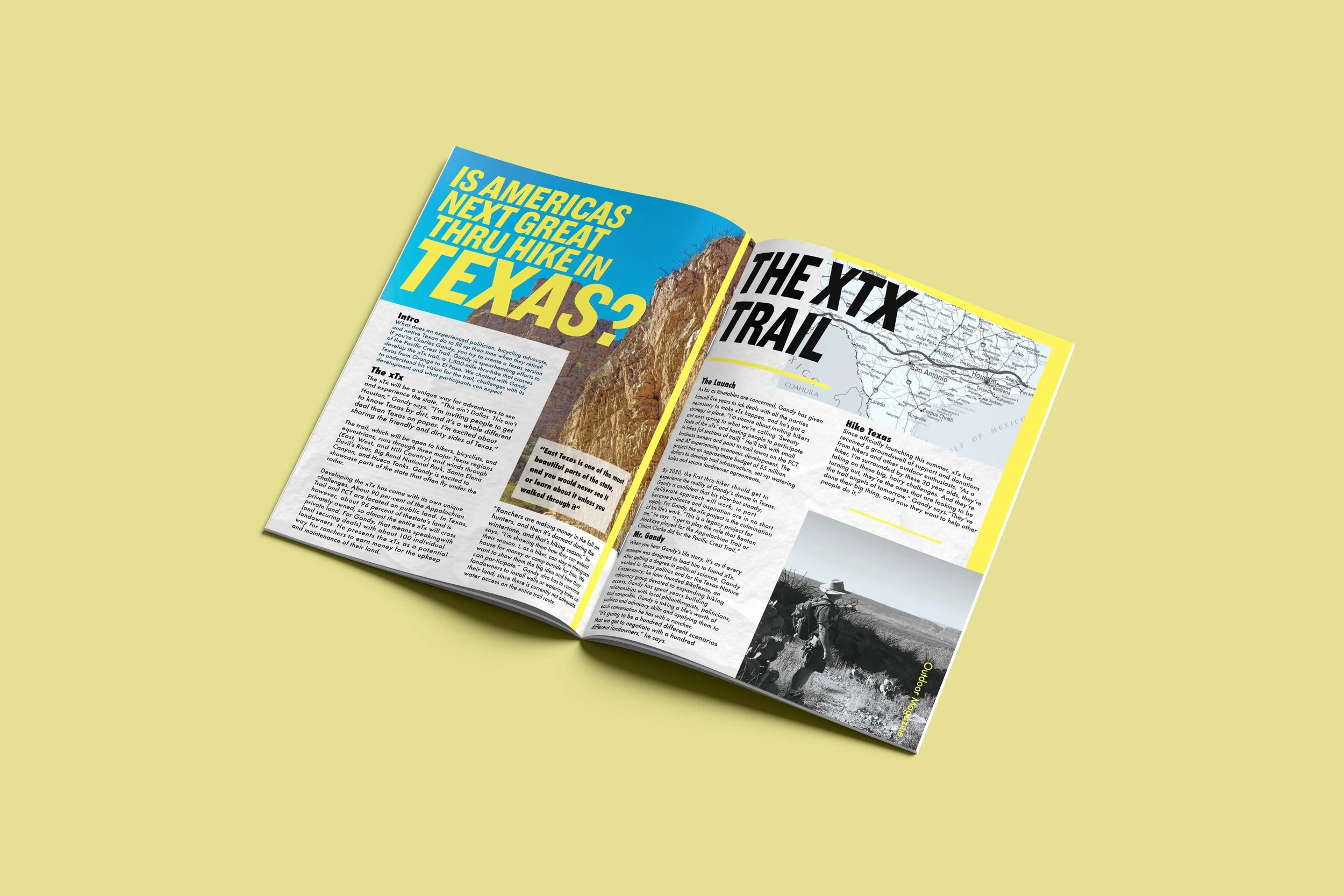
Mockup
Especially in print media, mockups can be a cheaper and efficient way to see a product without paying to have it printed.