
Nick Schneider Design
Typography Poster
Typography Poster Design
Throughout this project, I explored the importance of grid systems as well as how breaking grid systems can add visual intrigue. This project ended up being an exploration of the different vibes of the iconic city of Vegas, with a red and yellow color palette representing vintage Vegas and the 4 Queens Casino, while the black and neon palette represents a more modernized Vegas, centered around the vibrant night culture of the city.
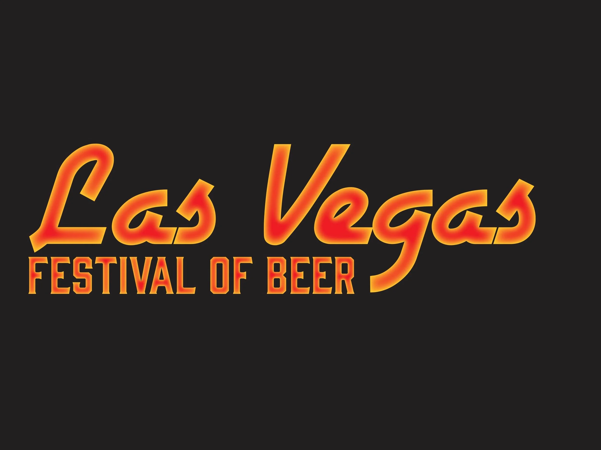
As well as color, the typography of the words “Las Vegas” is extremely effective when it comes to reflecting the atmosphere of Las Vegas. Overall, this project was extremely productive in developing my foundational understanding of grid usage.
Original
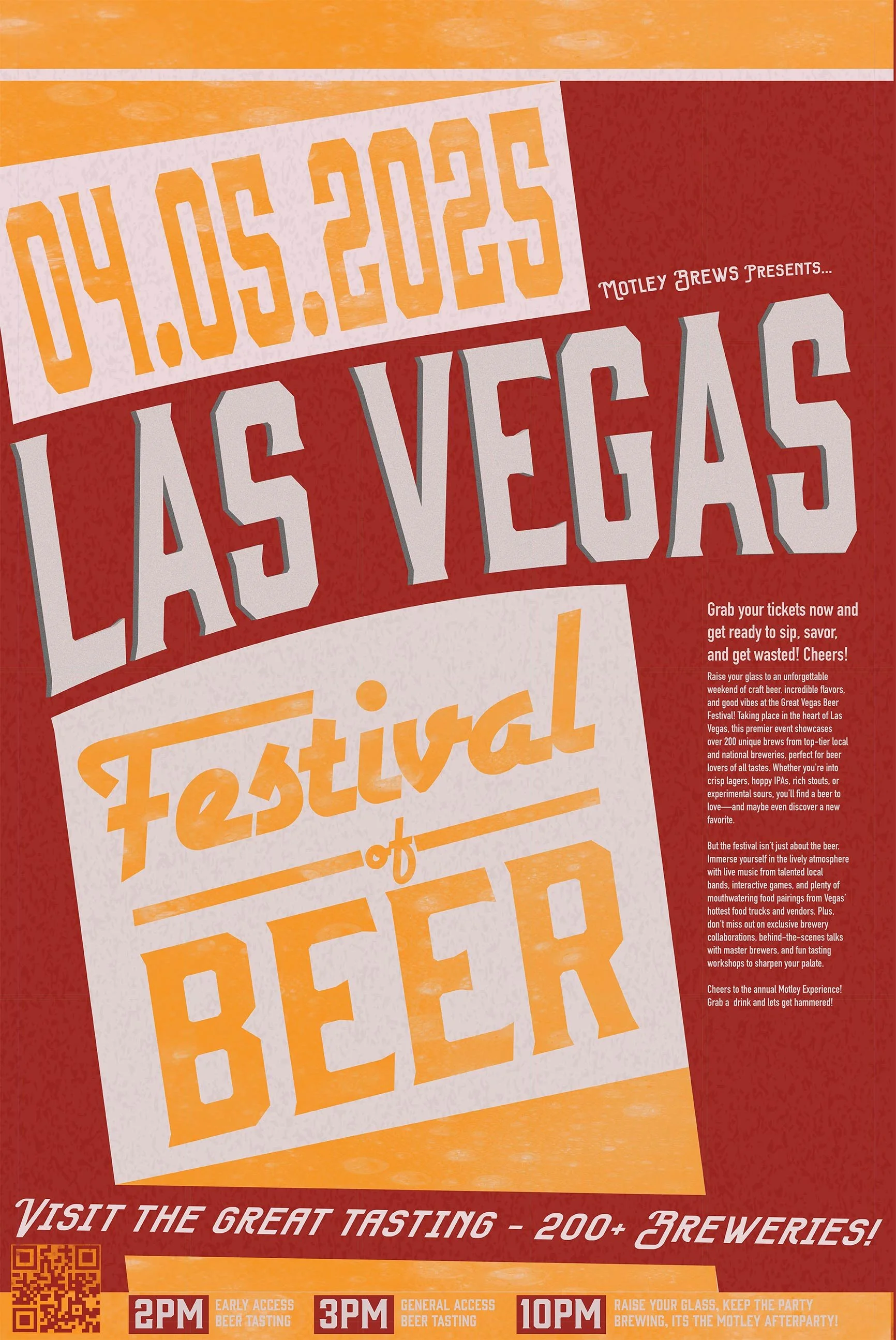
The original design features a more retro Vegas aesthetic with a color palette often associated with food and beverages
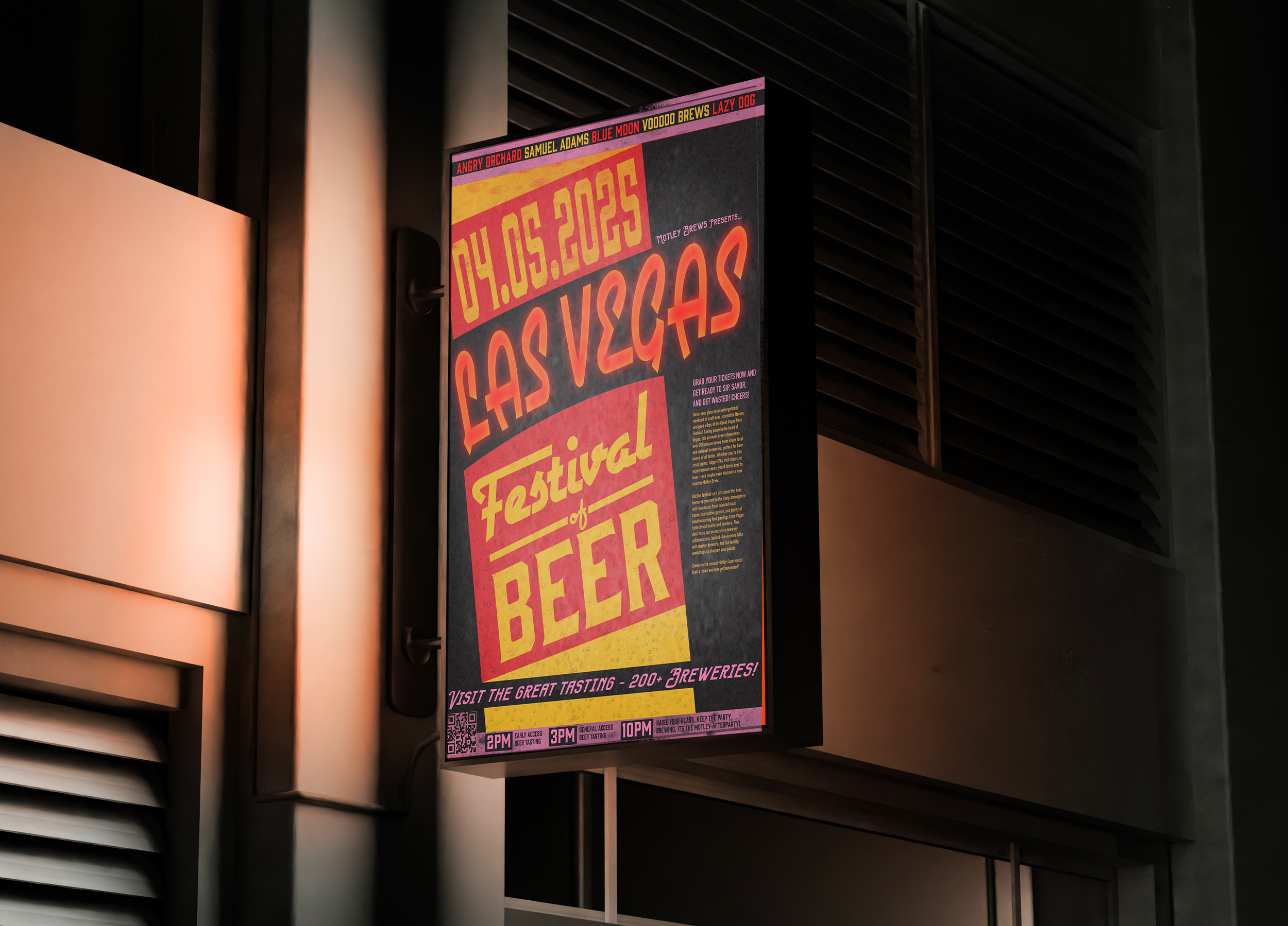
Updated

The new design embraces the bright night life of Vegas, making the design more cohesive to today’s Vegas.

Mockup

Design Process
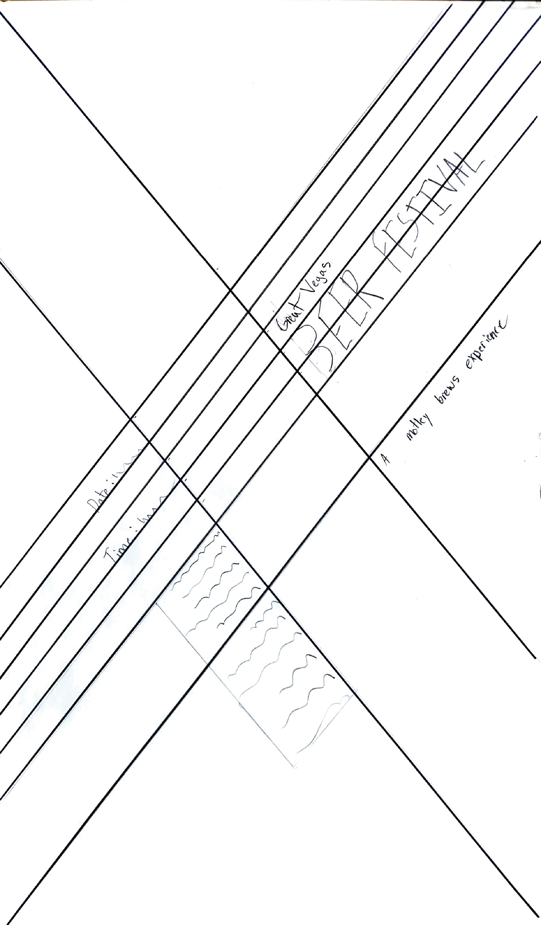
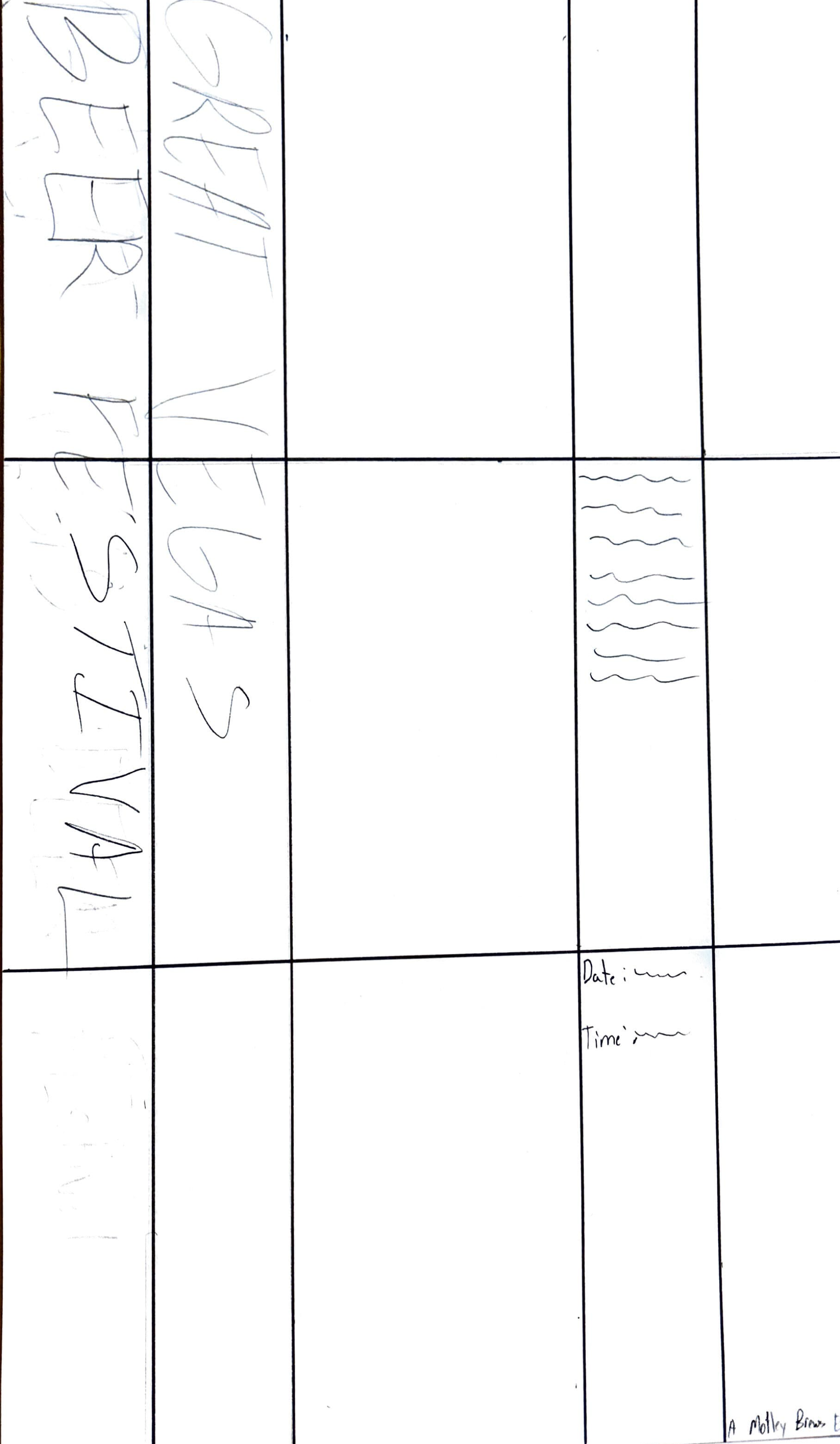
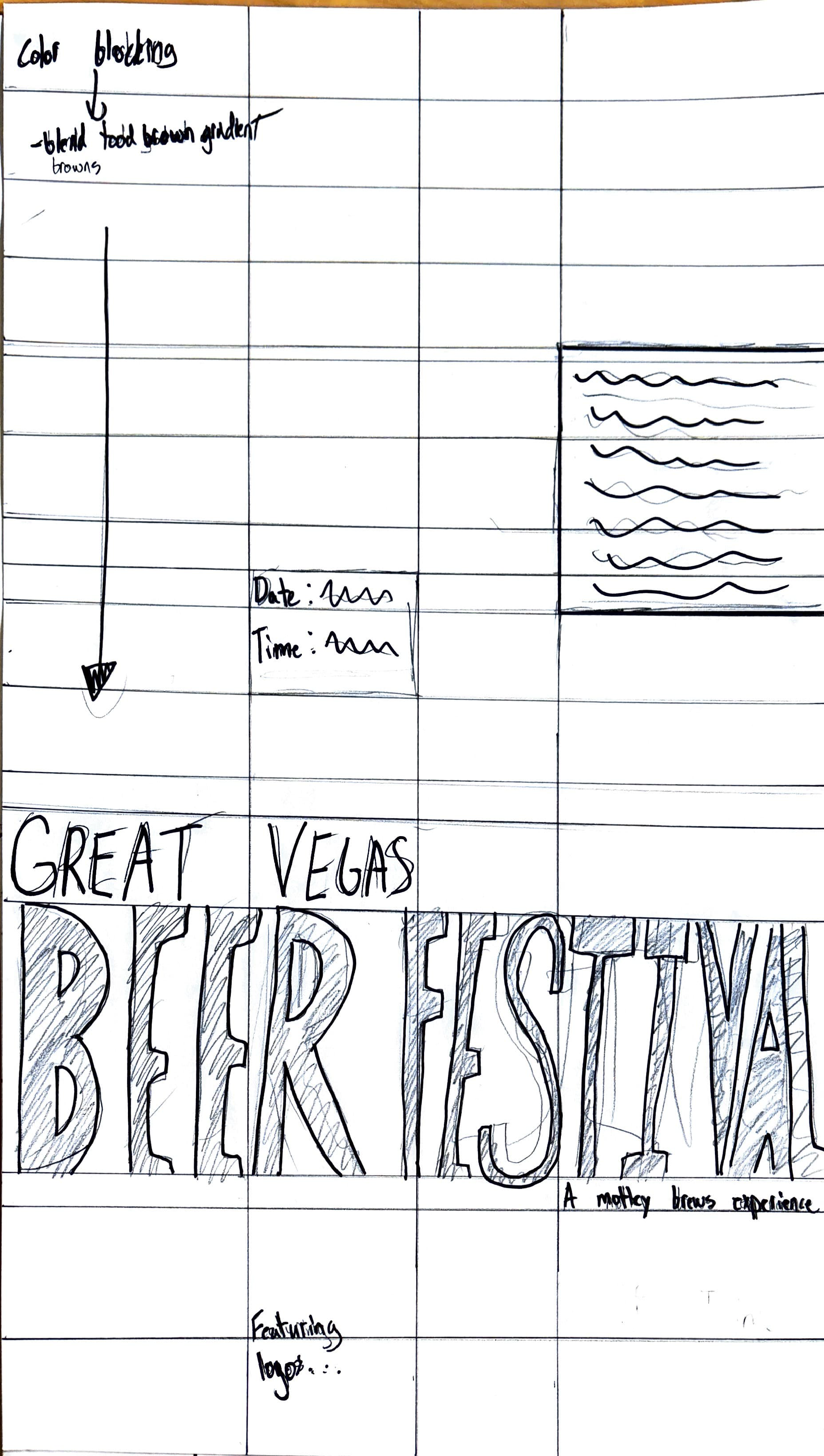
Sketches


Other Design Concepts
By bringing forward 3 designs at the beginning, I was able to combine the successful elements from each into a singular successful design