Nick Schneider Design
Bitmap Monogram
Bitmap Monogram
Throughout this project, I explored many different ways to balance simplicity and legibility with visual intrigue. My original goal was to design a bitmap that is extremely legible from all angles, but the final product ,although easy to read, featured too many ornamental element. The second attempt was designed to embrace a slightly abstracted and systematic approach, reliant on minimalism.
Personally, I believe the revised version is much cleaner looking, with clear intent behind every decision. Since the design is rooted in minimalism, it relies more heavily on the Gestalt principles of unity. This project was an extreme struggle as there were strict guidelines put in place, serving as a severe creative block and leading me to an extremely limited amount of solutions. These guidelines forced me to shift my focus from creativity to practicality.

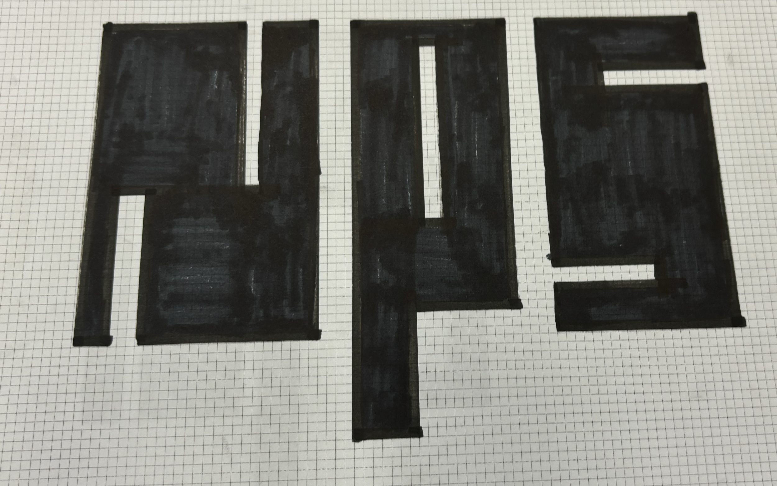
Original
The original design featured many elements that were ornamental rather than intentional aspects of the design
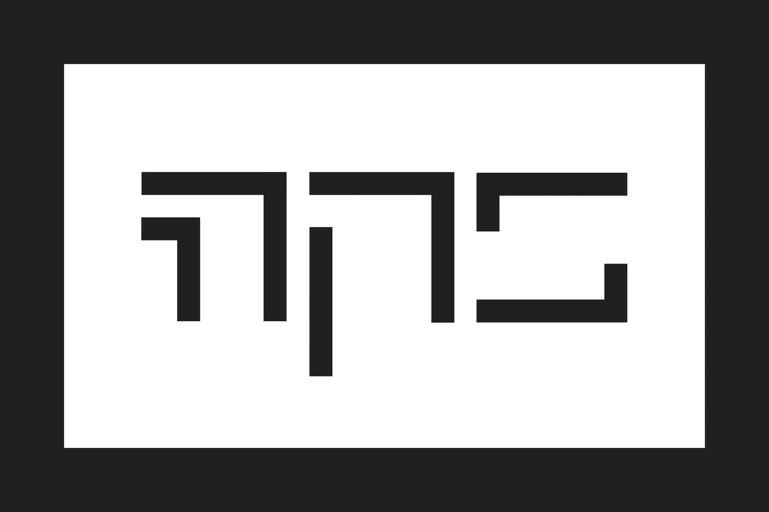
The new design places more emphasis on the form of the letters themselves rather than adding unnecessary elements