Nick Schneider Design
Boston Branding
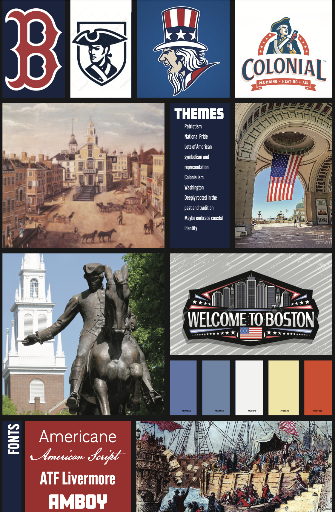
City Branding Design
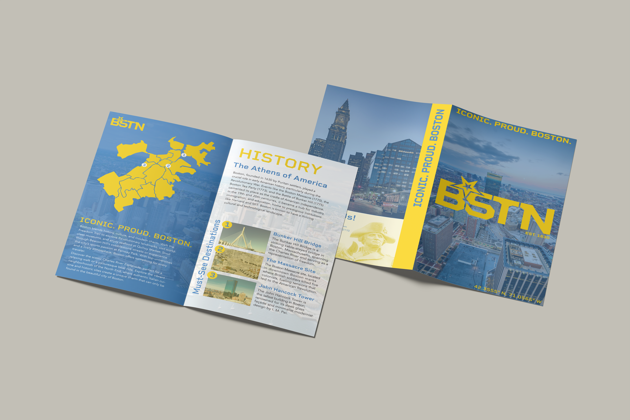
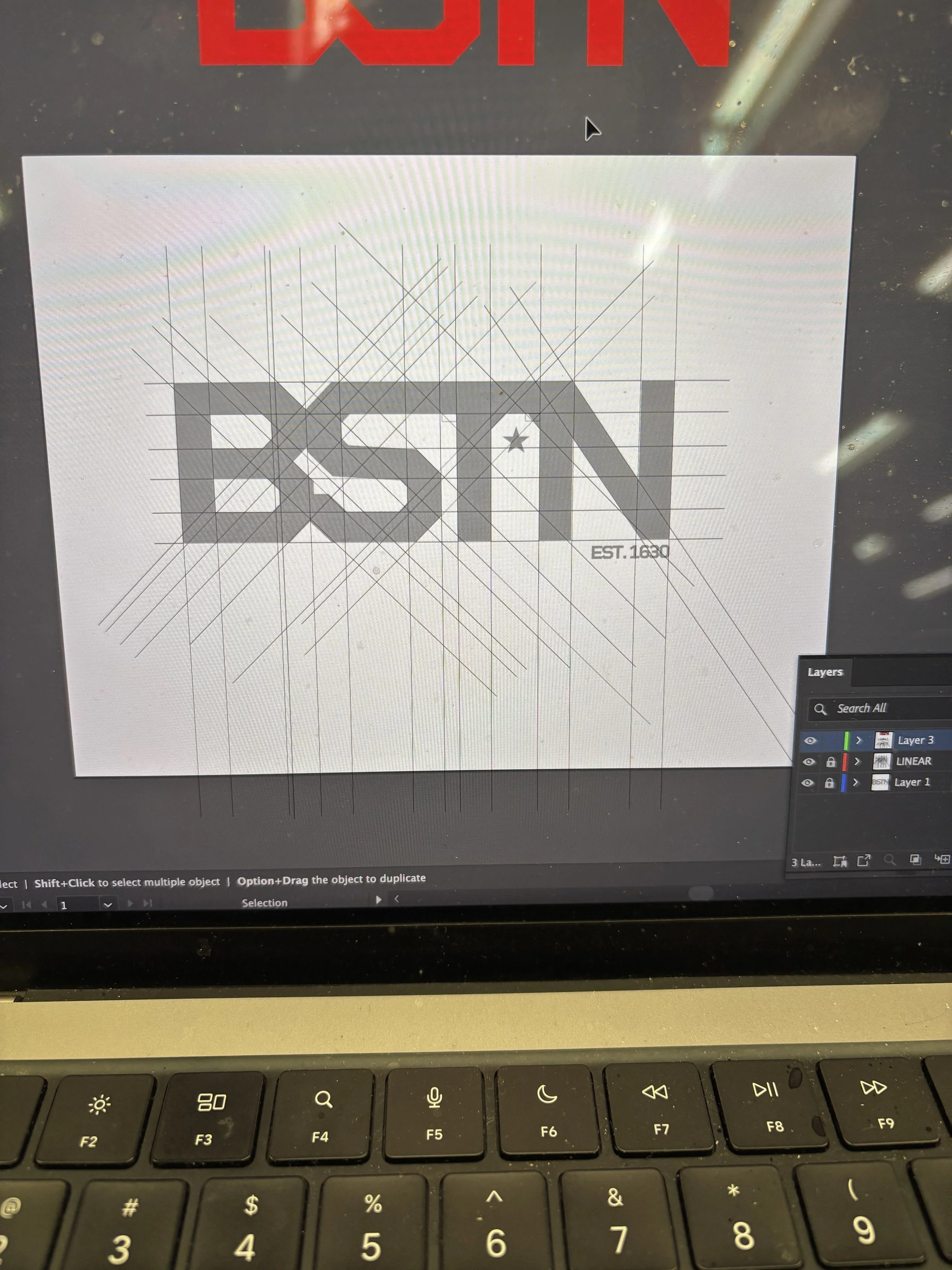
Throughout this project, I aimed to represent Boston in a modernized fashion, while still embracing the colonial heritage of the city. I did so through a modern font and using colonial symbolism such as a star and a hidden outline of a tea bag in between the T and the N. My logo system focused on variation, as I believe that recurring elements help a brand establish consistency, while also supplying options for every scenario. Throughout this process, I learned the importance of brand adaptability in a systematic manner.
Original
Updated
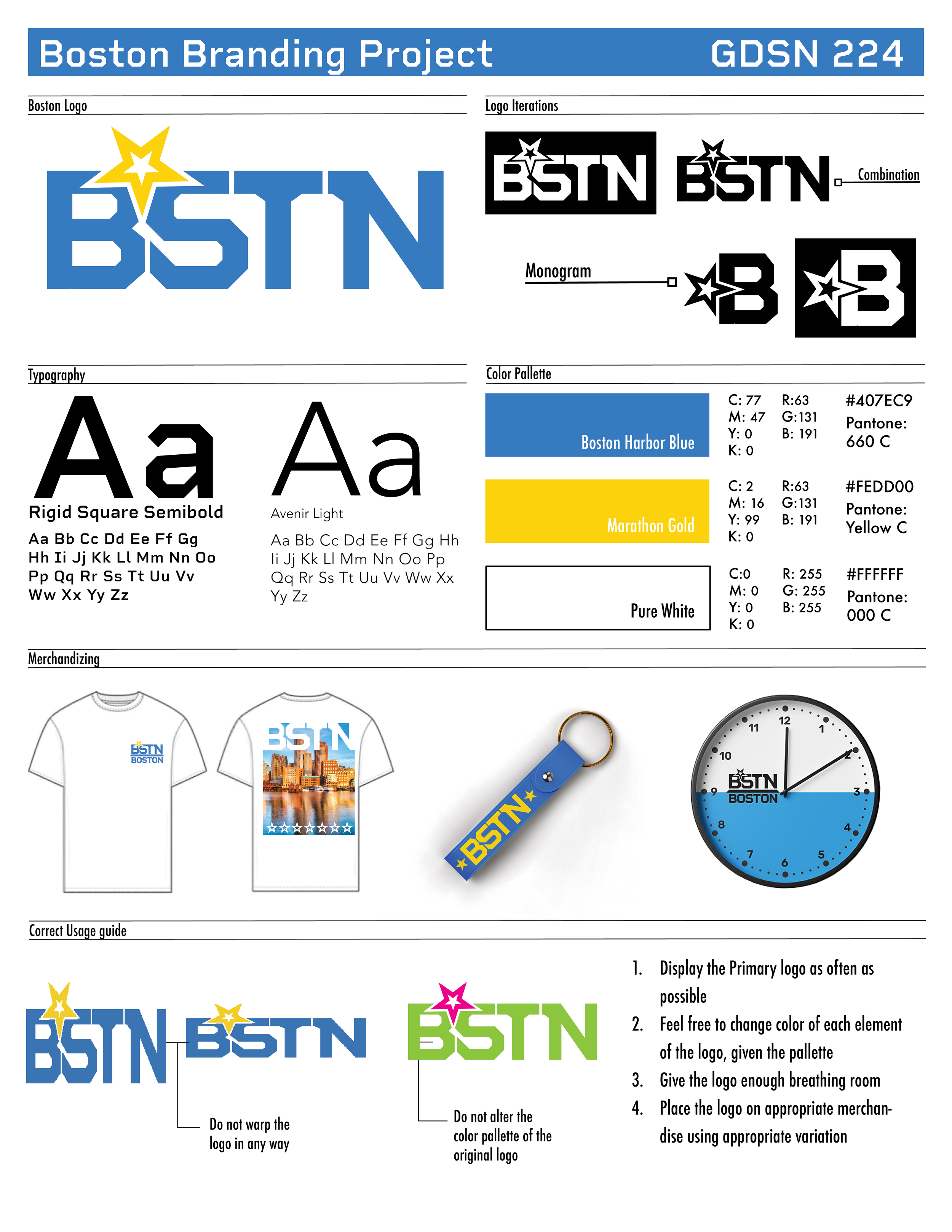
Style Guide
Creating a cohesive style guide is essential in branding as it outlines all the essential typefaces, color pallets, and correct usages for a logo. This basically outlines the intentional elements of the logo and how they should be used professionally.